So, you’ve contacted your manufacturer. You’ve set up your processes. Your online storefront is built. You’re ready to go, right?
Not so fast.
You might be neglecting one of the most important parts of the entire process: the checkout.
The checkout is a primary choke point for customers, and a lot don’t even make it past the first step. 28% of American online shoppers have abandoned a shopping cart for no reason other than the checkout process was too long or complicated. It’s a huge problem for many eCommerce checkouts.
Are you putting up roadblocks or clearing the way?
Thankfully, many of these mistakes are easy to take care of with just a small investment of effort up front. If you follow a few basic principles, you can improve your checkout and make sure your customers have the best experience possible.
Roadblock #1: Creating an Account
Many sites begin their checkout process with a simple question: are you new here, or are you a returning visitor?
It seems like a logical place to start. And even good eCommerce sites do this. But if we want the best checkout design, we need to make sure we’re not throwing up barriers from the very beginning. Having a customer begin by creating an account or trying to remember an old password contributes to cart abandonment. Fully 37% of all cart abandonments come from having to create an account to check out.
Often, users will rebel against the idea of having to sign up for yet another account. Whether that be because of not wanting to give out personal information too freely, not wanting to receive junk emails or just not wanting to take the time, it contributes to lost sales. Letting a customer check out as a guest is key to having the best checkout design possible.
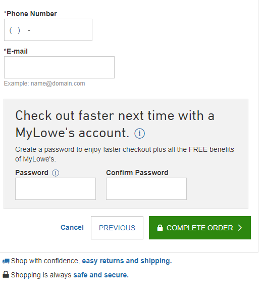
Leave a login/register link as an option above the checkout, but don’t use it as a gating process. Alternatively, you can leave it at the very end, like Lowe’s does. That way you’ve already captured all the information you need to create an account anyway.
Roadblock #2: Checkout Length
The next most common reason customers abandon carts is because of a too-long or over-complicated checkout process. 28% of all cart abandonments come from this.
A general rule of thumb for checkouts is the less pages, the better.
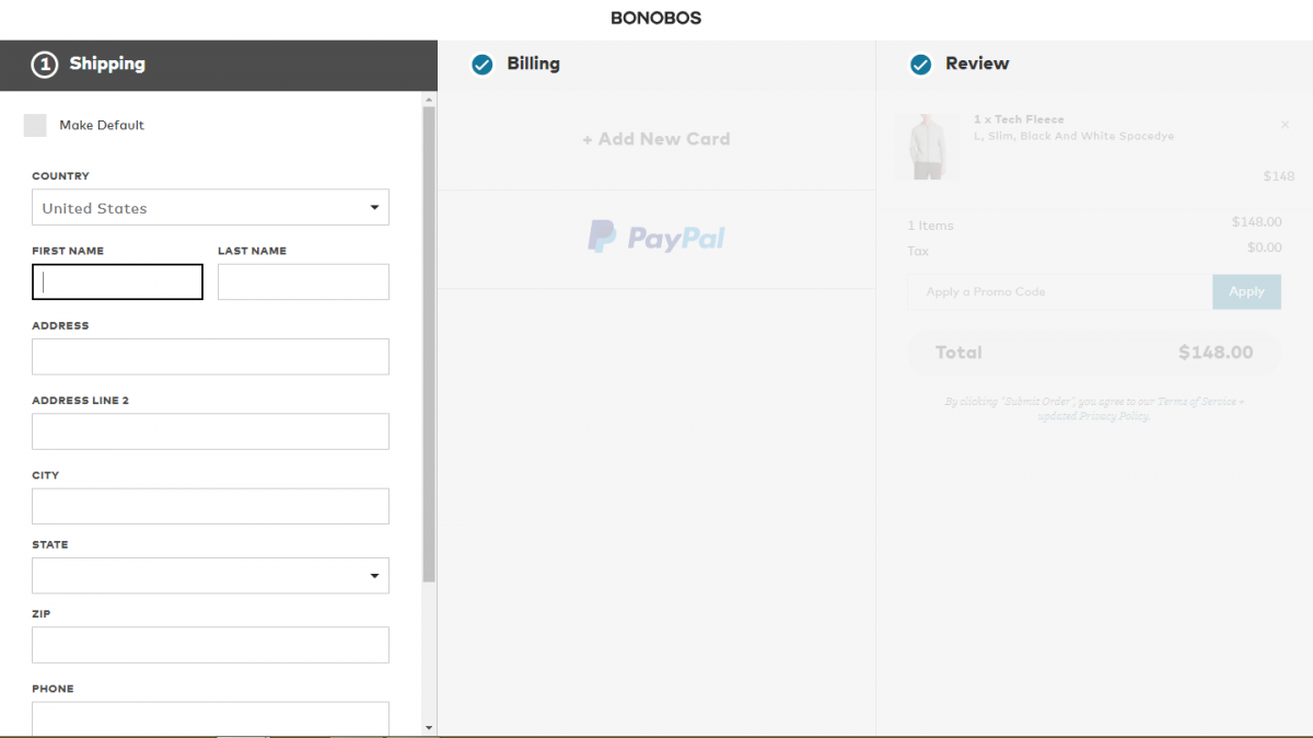
Many websites have their entire checkout on one page (Apple and Bonobos are two great examples). But websites that spread their checkouts over more than one page can do one simple thing that will contribute to customer retention:
Add a progress bar.
When the customer can see how much of the checkout is left, it contributes to them feeling more in control. Transparency is key to helping them have a good checkout experience, and having a clear sense of progression can help with that.
Roadblock #3: Nonlinear Checkout
Along the same lines as the above point, a checkout can also be over-complicated. Ideally an eCommerce checkout should be a smooth, clear road from opening the cart to finalizing the order.
Not all checkouts do this, though. Some create steps within steps, taking customers on detours—for example, redirecting a customer to a separate page to set a shipping address, then returning them to the previous checkout page.
Customers want a linear checkout process. Taking them on detours contributes to confusion and cart abandonment, leaving them short on patience and you short on sales. Keep your checkout process as straightforward as possible—see this Bonobos checkout, which is beautifully simple and completely contained on one page.

A one-page checkout isn’t feasible for everyone (for example, if you’re dealing with separate shipping and billing addresses, or need extra information). But the less pages you need and the more linear you can make the process, the less likely you are to lose sales to frustration.
Roadblock #4: Inconsistent Look and Feel
This should go without saying, but your checkout should have the same look and feel as the rest of the website. A good eCommerce checkout carries over the same visual themes from the rest of the website design, from fonts to colors to shapes and design element spacing.
Don’t just roll with something out of the box—have your UX designer take a look at the checkout, too. It’s an easy thing to tack on at the end, but it’s the end of the customer’s engagement with your site. Make sure it contributes to a unified overall impression.
Having a unified design helps your site look more professional and put-together, which makes customers feel more secure and improve checkout. 19% of cart abandonments come from customers who don’t trust the site with their payment information, and look and feel contribute a great deal to that. Don’t neglect design.
Roadblock #5: Asking for Billing First
The most important part of the purchase for you may be getting paid, but the most important part of the customer’s experience is receiving the product they paid for.
Asking for billing information first feels logical, but it can contribute to cart abandonment. Asking for shipping information instead has the subconscious effect of reassuring the customer that you put them first, not yourself.
Bonobos has been a leader in eCommerce checkout best practices (and eCommerce in general, for that matter). They do it right. See how they ask for shipping information first here? It’s an outgrowth of their customer focus, which has been a key component of the company since the very beginning.
Roadblock #6: Lack of Description
It seems like a no-brainer, but adding descriptive labels for every field will significantly help your eCommerce checkout ease of use.
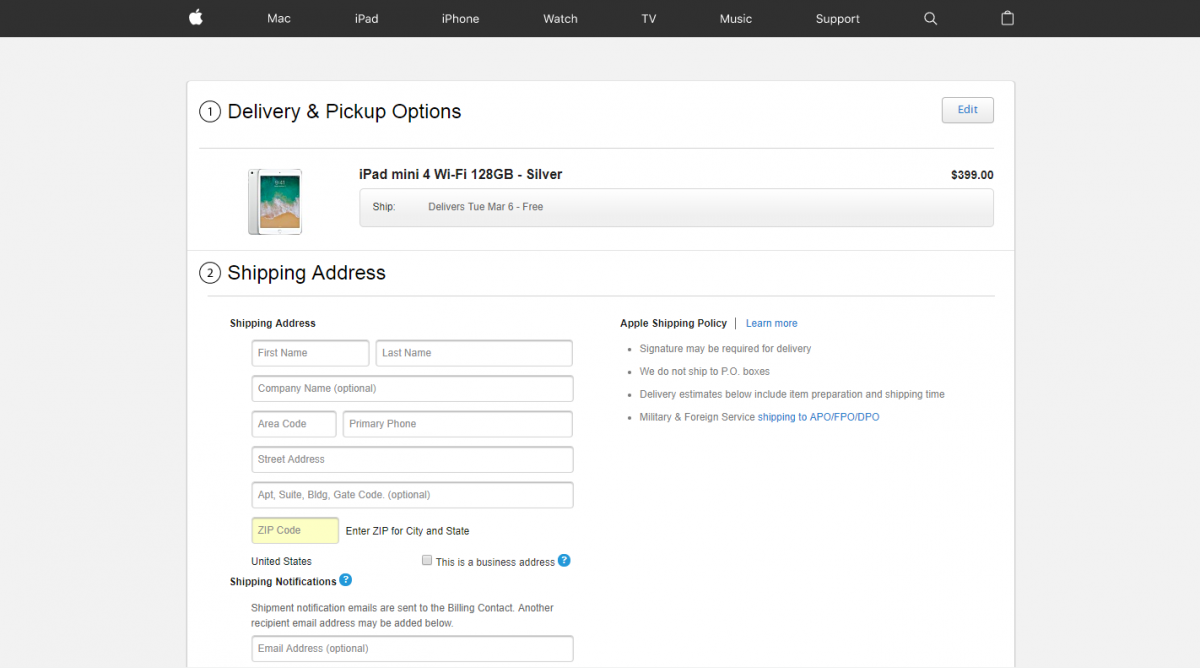
When test subjects were confronted with some label-less fields in one study, they frequently began typing the wrong thing into the field. Apple was a particularly egregious offender, with the phone number area code and zip code fields routinely causing confusion.
They’ve since corrected that, and their current checkout is both simple and descriptive, ensuring that customers don’t have to waste time and frustration on retyping fields.
When you’re tailoring your eCommerce site to your customers, the last impression needs to be just as good as the first. Avoid these roadblocks and create the best checkout process possible, and you’ll be well on your way to optimizing your sales.